Sunday 9 October 2011

Dsdn - 171 - assignment 10

Postmodernist and ‘remix’ techniques are a vibrant part of our design culture today. Find an example of contemporary design—2D or 3D—and post it to your blog along with a description of 
what techniques it utilises (i.e. historical quotation, ornamental eclecticism, wit or irony, manipulations of scale, cultural symbols etc.) and how they serve to ‘add meaning’ to the work.

Postmodernist and ‘remix’ techniques are a philosophical movement away from viewpoint of modernism. It’s different from other design styles, it takes styles from the past and is manipulated and mixed together to create a unique design style.

An example of postmodernism is the violin and piano shaped building, it is located in the An Hui province of china. The violin and piano building mixes different styles in its design for example it uses scale as a main factor by scaling the instruments into a size of a building which is way beyond the size of any normal instruments. This building is heavily ornamented, it is no longer obvious to the user. The violin is serving as an entrance to the building and the piano is the main building, But it’s not obvious, it looks like a giant statue if you didn’t know it was a building from afar.
These styles of design is help portraying the culture and Cory Hall (2009 July 24) “stereotypes about the Chinese” [Web log post].


Web log post retrieved from: http://coryhall.wordpress.com/2009/07/

Sunday 2 October 2011

Dsdn - 171 - assignment 9

1945 cold war was an ideology war where the communists and the non-communist (America), the America was believed to be “the good life”, and claimed it was the better than Russia and they provided a better life style for its people. George Marshall started “The Marshall plan”, the plan created consumer markets and put out the idea that consumerism was freedom. America “Offered a bright vision of material abundance to assuage the privations of Europe” (Pavitt, 2008, p. 75) in an effort to convince Europe that a consumerist society was the way to rebuild the economy.

American corporations sold not only products to the people, but firstly and fore mostly the idea that their products were necessary, would make one happier, and would improve one’s quality of life. Woman was seen as the consumers therefore lots of marketing came out that put forward the idea of consumer choice.  This marketing was aimed at the woman and this was meant to in courage them to buy the goods and make them happy.

Image below is a Coca-Cola’s summer ad of a group of young adults having fun, drinking Coca-Cola. They are full with energy. This advertisement was aimed at young adults and teenagers as they want to have fun on summer. It's meant to pull this user group in and make them want to buy Coca-Cola so they too can be exciting, fun and "the good life".


Dsdn - 171 - assignment 8


Do you agree or disagree with the position that design is a result of “function x economy”? Do you think design today an ‘art’ or a ‘science’? Should it be one or the other, or can it be both

Walter Gropius focused on substantive functions and efficiency in terms of design “He supported artistic freedom and individuality rather than the imposition of typical standardized forms”. (Raizman, 2004, pg. 181) Hannes Meyer who took over as director in 1928 believed the combination of industry and art are right in the way of think about design.

I believe design is a result of both “art” and “science” because design is a work of art which appeals to the consumers, but without science the design would be useless. If materials weren’t tested, it wouldn’t be suitable for the object. The image below is good an example a fix of art and design, without science the designer wouldn’t know if the wood would hold or not, for all we know he could of used cardboard, and without art it the designer wouldn't of thought of something like this and just made another simple chair with 4 legs on the ground holding it up.


Dsdn - 171 - assignment 7


In this week’s lecture we discussed the concept of the “symbolic universe” as a cultural “structure of legitimation” capable of organizing the social world as comprehensible and connected.  The structure of the symbolic universe then, places the individual in a known and knowable space. Such social structures are critical for societies in transition. Can you identify the creation of any “symbolic universe” today (or in recent years)? How might media and design be implicated in the construction of these social universes today?


Advertisement is one of the creations of “symbolic universe” today, it’s all around us, and no matter where we look there will be some form of advertisement. Companies are creating advertisements to make us believe their products will help us improve our life styles.


This perfume advertisement is a good example of a creations of "symbolic universe", the ads showing a beautiful woman being treated like a princess when wearing their perfume, this is portraying that the consumer will become a princesses upon wearing the perfume, the ads are taking advantage of the consumers desire to be loved and treated better. It is ridiculous to even think about becoming princesses by just by wearing some perfume, but yet consumers are still buying it, because subconsciously they can't help but believe it.


Media and design are implicated in the construction of "symbolic universes". it is the design of a advertisement that sells the ideals to the consumers, media help spreads the ideal in all shaped size and form.

Saturday 10 September 2011

Dsdn - 171 - assignment 9? 5? oh it's 6

In response to Walter Benjamin’s statement “To an ever greater degree the work of art reproduced becomes the work of art designed for reproducibility. From a photographic negative, for example, one can make any number of prints; to ask for the authentic print makes no sense.” Do you agree or disagree?

I strongly agree with Walter because when something is reproduced it will no longer authentic, and the aura about it is lost. Authentic print has no meaning in the digital world because everything can be reproduced with a click of a button. We download copies of images and songs so much that all aspects of aura have been lost, because everyone else can also download a copy of that image and song, then it will no longer be authentic.

Do you think there is a role for the ‘authentic’ in an age of digital design and manufacture?

I believe there is no role for the ‘authentic’ in an age of digital design and manufacture because everything can be reproduced and copied without any noticeable difference, numerous people have the same phones, cloths, shoes, pens, and the list is endless. The point is there will always be someone out there that will have the something you do. Authentication is no longer possible in this age.

Dsdn - 171 - assignment 5

How has the experience and experimentation of artists influenced our understanding of colour and the development of a theory of ‘colour vision’?

In 1704 Isaac Newton influenced our understanding of colour by experimenting with light and colour. Isaac Newton reflected a beam of sun light through a prism which created a composition of colours arranged in a sequence. This experiment led to the discovery of colour theory and our understanding of colour.

Goethe Wolfgang opposed Newton’s mathematical perception on colour because he was interested in colour vision. Goethe Wolfgang’s theory dynamic interplay of light and darkness through the mediation of a turbid medium, this allowed artists to paint how they felt and their viewers a direct experience. Artists saw painting as an opportunity to manipulate colour, they started to use their own perception of colour. Painters now use the colour vision theory to interpret their feelings. From these interpretations viewers are also able to have their own experience.

Dsdn - 171 - assignment 4

Bow Wow Dog Speakers (image found at


Adolf Loos argued in 1908 that, “The evolution of culture is synonymous with the removal of ornament
from objects of daily use.” Do you agree or disagree? Why?
Loos believed that the less ornament, the more civilized we are. I disagree with him because without ornamentation everything will look plain and boring. People wouldn’t be able to express themselves. Things without ornamentation will lose the emotional feeling that people have towards it and can no longer tell the story of its owner. The image above is of a set of speaker, which is shaped like dogs. These speakers tell us, the user is a dog lover and is emotionally attached to these speakers. Ornament help object and people stand out and show who they are.

Adolf Loos argued “Ornament does not increase the pleasures of life. If I want a piece of gingerbread I will choose one that is completely plain…it tastes better that way.” (Adolf Loos) I also disagree with this statement made by Adolf Loos because everybody has different tastes, some people like it sweet and some like it plain.

Saturday 30 July 2011

Dsdn - 171 - assignment 3


In The Grammar of Ornament (1856) Owen Jones argued that, “Construction should be decorated. Decoration should never be purposely constructed.” Jones states that objects should stay true to its functions, and the decoration should not be over the top, where the decoration becomes the object, and the function is no longer obvious to the user.

I disagree with Jones because it's limiting the creativity that designers can offer, Every thing will look alike and will not evolve. Design shouldn't be limited by rules which tells you what you can and can't do, instead it should be free and creative.
.
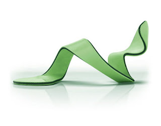
Take this Mojito shoe designed by Julian Hakes for example according to Jones rules, this design is a 'false principles of design', This high-heal might look like squiggly green caterpillar thing but it will still serve its function as a shoe, with its unique look and style it really shows creativity and what designers can do without all these rules and limitations.


Friday 22 July 2011

Dsdn - 171 - assignment 2


An example of the continuing curve is the Chair Loopita by Victor Aleman.The subtle feminine features can be found throughout the design. The twisting of the chair soften the appearance and the shape flows together very nicely, The surface have a nice gloss which is creating a beautiful, smooth, relaxing and sensuous environment.
I believe that this design is the result of sensuous impulse because of the twisted shape givesing it an feminine feel to it. The chair has been designed to please and attract people in an emotional way and it still serves its purpose as a comfortable chair.

Friday 15 July 2011

DSDN - 171 assignment 1


Handheld Cellular Phone

Designed by Martin Cooper in 1973 when he was vice president and division manager of Motorola, the handheld cellular phone was revolutionary in how it could make a direct call to the person instead of a place.The phone weighed about 1.1 kg and with 35 minutes of talk time, it might not be the ideal phone, but it was the start of something big. Handheld cellular phones has inproved and it's part of our everyday life now and it was all made possible by Martin Cooper.

Sunday 12 June 2011

Open letter


 This is a wrapper which you can find on any Pepsi bottle, and instead of the ingredient on the back i replaced it with my letter.

Friday 10 June 2011

Poster

 In the background there's a Coca-cola truck driving past, which is showing there are more demands for Coca-cola than Pepsi
For my poster i used the Pepsi logo as a base for the poster, and assigned the top half with Coca-cola and the bottom half with Pepsi. I gave Pepsi less space is because it simply have less consumers and less demand compare to coca-cola. the heavens gate is a great metaphor for Pepsi, translates to only chosen ones can enter heaven, which relates to Pepsi in how they aim their advertisement on a minor group of people. Coca-cola is represented by the city of wellington which translates to it's for the people.

 Precedent image
I like how you can get the colors of coca-cola and Pepsi in the Pepsi logo, which allows you to brake them and compare them.

Word

Final 2


i chose to use the dried leaf grid because it emphasize the work target really well, the leaf stands out from the grind.

development images


 With these images i tried a few different grids. first i have the dried dead leafs on the ground, which i think really emphasize the word "Target", next I place my "target" leaf on a tree which gave it this natural grind, last but not lest i took some leafs from the trees and place it on the ground to form a grid, it didn't turn out as well as i had hoped.

Tuesday 31 May 2011

final 15 second ad with sound

For our advert we wanted to portray quality whilst trying to appeal to our targeted market of young professionals. So during our planning we decided on a advert that would have quite a humorous approach and that we would try to work with an animation program to eliminate the often quite jittery effect that a stop motion clip has. The meaning behind our clip is that our speakers are such high quality that they can blow you away, our animation shows a milk bottle turning on the stereo and getting blown into the wall from the extreme sound our speakers can produce. Because our ad is all in animation we were able to achieve a high quality video and make it some what humerous, meaning we achieved both our goals set in our brainstorming session.

 Team-members
Baoxiong(Jordan) Dai
Ryan Limmer
Luke Syred

Thursday 21 April 2011

Baoxiong Dai - Dsdn 101 - project1-HW1:TYPE (reassessment)

 In the reassessment, i wanted to go back to taking pictures of the wire this time i used five different colour wires and twisted them together, that way they don't look as boring.
I personally think it looks way better then when i first tried it with just one colour which was white/silver and you cant tell if its wire or not. With five different colour it looks like the inside of the cable wire where you have a few smaller wires with different colours.

Wednesday 30 March 2011

Baoxiong Dai - Dsdn 101 - project1-HW1:TYPE

I chose to use a wire like typeface because my quote was  "designers put the wire into our heads"
so i started taking pictures of wires that formed a letter. After a few pictures, it didn't turn out as well as i had pictured in my head. so then i took the idea of wire, how they are loopy with no sharp edges and drew it that way.

Baoxiong Dai - Dsdn 101 - project1-EX6.AXO1

Baoxiong Dai - Dsdn 101 - project1-EX5.SKETCH

Baoxiong Dai - Dsdn 101 - project1-EX4.SECTION

Baoxiong Dai - Dsdn 101 - project1-EX2.DRAW

Baoxiong Dai - Dsdn 101 - project1-EX3.HATCH

Baoxiong Dai - Dsdn 101 - project1-EX1.IDENTITY

Baoxiong Dai - Dsdn 101 - project1-HW1:design quote